BeliefMedia likely is likely the most suitably qualified marketing company in the Australasian region when dealing with aviation media and integrated online applications (safety videos, online applications, marketing, promotions, airport support, social media etc). That said, and partly by virtue of the small size of the aviation industry, aerospace represents only a small portion of our support portfolio. However, for those of our clients that are in the aviation trade, we've reproduced a few very basic Google graph renderings from data sourced via our aviation (temperature) API. The features are typical of those that we'd suggest flying schools and other similar operators use to keep dynamic elements attached to their website.
Note: This feature is now deprecated. See our article on the METAR API, or another that introduces weather graphing.
Note: All the graphs were removed from this page pending our own graphing API. The article is kind of pointless without them.
These graphs are basic and only intended to give our aviation clientele a little inspiration when thinking about how to best deal with their website presentation. In reality, it might only be a single temperature and wind strength that might be used... but it's important for our partners to know that the data is there to be used.
Note: All graphs related to Sydney Airport and are cached for period of up to 5 hours to avoid unnecessary requests to the API. Code and usage can be found from within the client area.
ATIS Temperature
The ATIS graph below shows around 24 hours of historical data by default. Because ATIS information is 'real time', it's generally the most accurate source if regular requests are made. The graph is useful for measuring trends. For example, a rise in temperature that might compromise upon aircraft performance can be quickly identified meaning that takeoff and other data can be provided to pilots based on a predicted value.
[atisgraph]
Temperature Range (Candlestick Chart)
The following candlestick-style chart indicated the lowest and highest temperatures over the course of a week. Expanding or contracting columns might indicate a trend worthy of investigation.
[temprange]
The same chart may be used to graph QNH (pressure) from the same shortcode function.
Temperature and Dewpoint (Column Chart)
The following line graph indicates the temperature and dewpoint values from the preceding 36 hours. Again, a trend or narrowing of the temperature and dewpoint might indicate a pattern worth investigating (to mitigate the risks associated with fog). In company with the wind strength and direction (and the actual report), it's a handy graph.
[temp_dp]
Temperature and Dewpoint (Line Chart)
The temperature and dewpoint values below are the same as above except that they're rendered into a line chart. I've found that a line chart tends to give a more immediate means of measuring trends of temperature closure.
[metar_temp_dp]
Pressure Gauge
The gauge charts are handy for temperature, dewpoint, QNH, and wind strength.
[metarpressure]
Activating METAR Reports
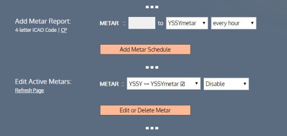
There are thousands of METAR stations and we don't archive them all by default. However, you can start the archival process yourself from within our client area. By selecting "Data Sources" and navigating to the bottom of the page and selecting "METAR Reports", you can add a METAR report to Twitter or simply start the archival process. Once we start archiving we don't stop - even if you delete that station from your distribution list (so all the data is available via our API in the future).
Note: This feature is now deprecated. See our article on the METAR API, or another that introduces weather graphing.


